product design
research
user/stakeholder interview
heuristic analysis
information architecture
wireframing
interactive prototypes
usability testing
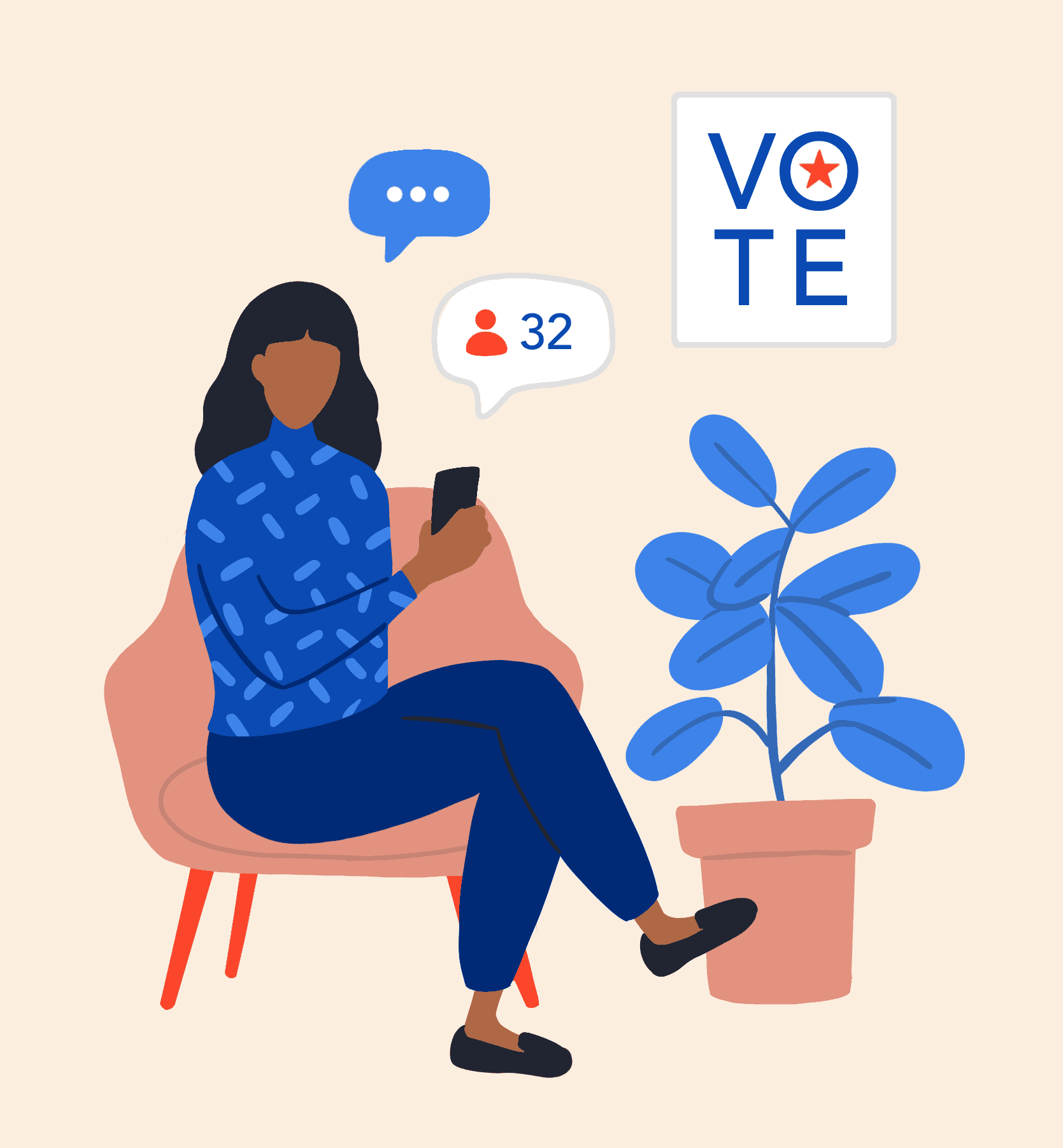
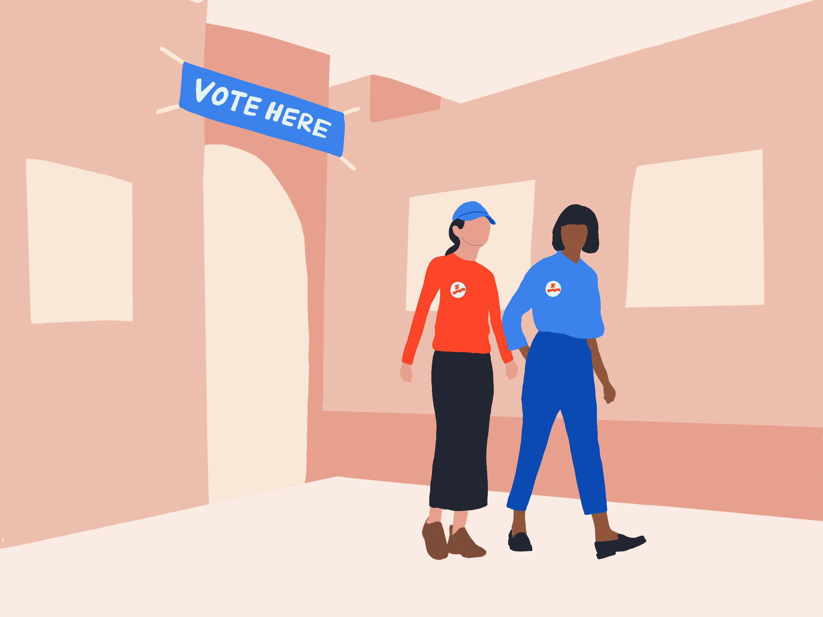
illustration
I worked with a team of one product manger, four developers, and four internal stakeholders. I was the sole designer on this project.
Nora Grossman (Product Manager), Nick DiRienzo (Head of Engineering), Peter Stein (Senior Software Engineer), Caesar Nuzzolo (Senior Software Engineer), Maureen Z. (Senior Software Engineer), Davis Leonard (CEO), Zoe Stein (Chief Program Officer), Greta Carnes (Chief Strategy Officer), Fiona Ramsey (PR & Communications Strategist)
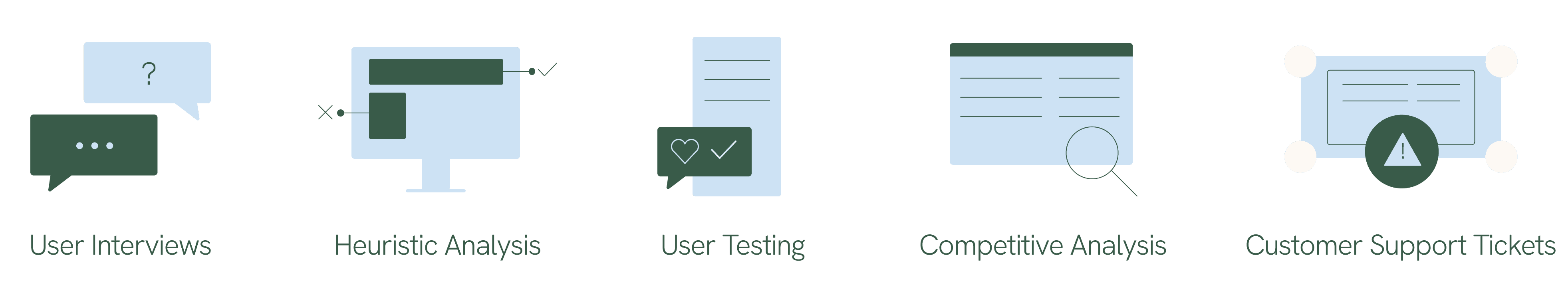
Research methods


Our research goals were to find out:
How are users reaching out to contacts (calls, text, in person)?
What sorts of strategies are they using in conversation with their contacts?
Why aren’t some users completing contact profiles?
How are they interacting with our products and competitors?
How do mobilizers gauge if they are performing well?
What are their motives for being a mobilizer?
How often do they follow up with their contacts?
Insights found in research included:
Lacked Wayfinding
Users didn’t always know they should complete the key question and actions on contact page
There was uncertainty about the most important actions to take and which to take first
They sometimes relied heavily on direct training from their coach to navigate the app
Voter Registration & Ballot Chasing
A major part of campaign strategy is targeting voter registration early on in the campaign and ballot chasing closer to the election
Campaigns needed to target contacts based on their vote plan, ballot status, and vote status
Curious about Performance
Mobilizers liked knowing if they were meeting campaign expectations
They were curious how their performance compared to other campaign mobilizers
People enjoyed the camaraderie of mobilizing as a group
Low voter file match rates
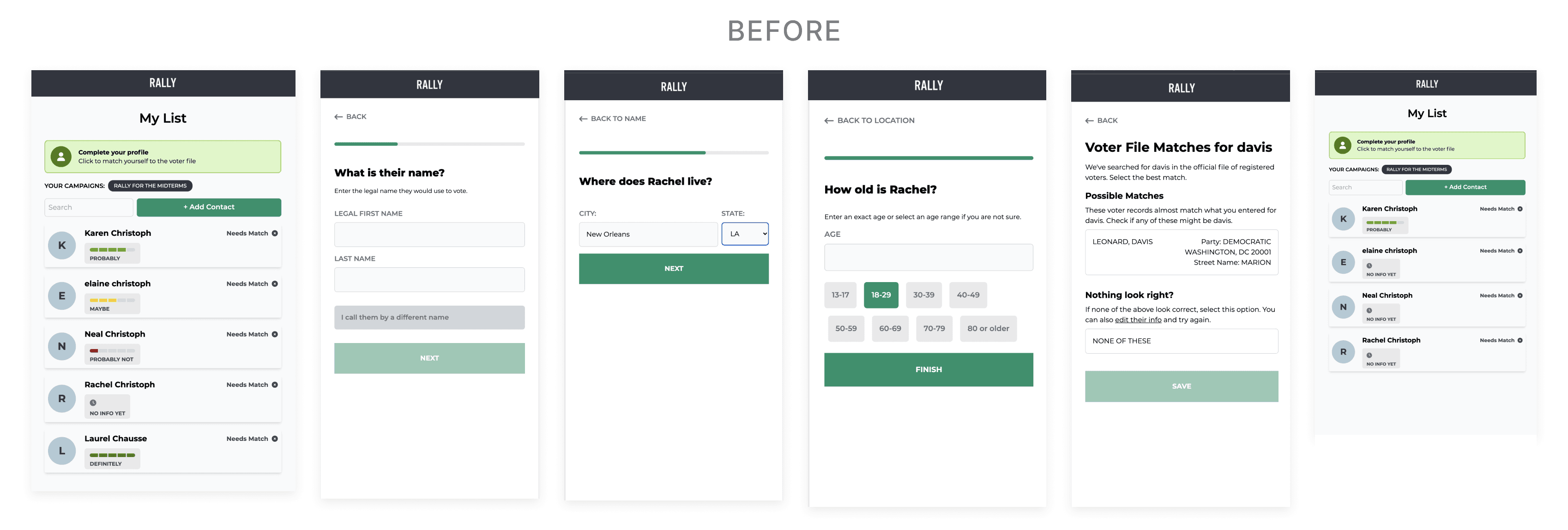
Users found the contact matching flow confusing
They weren't always able to match their contact on first try due to lack of or uncertainty of contact info
Contact Page Engagement
Some users were’t completing contact page details
A few users weren't referencing them at all
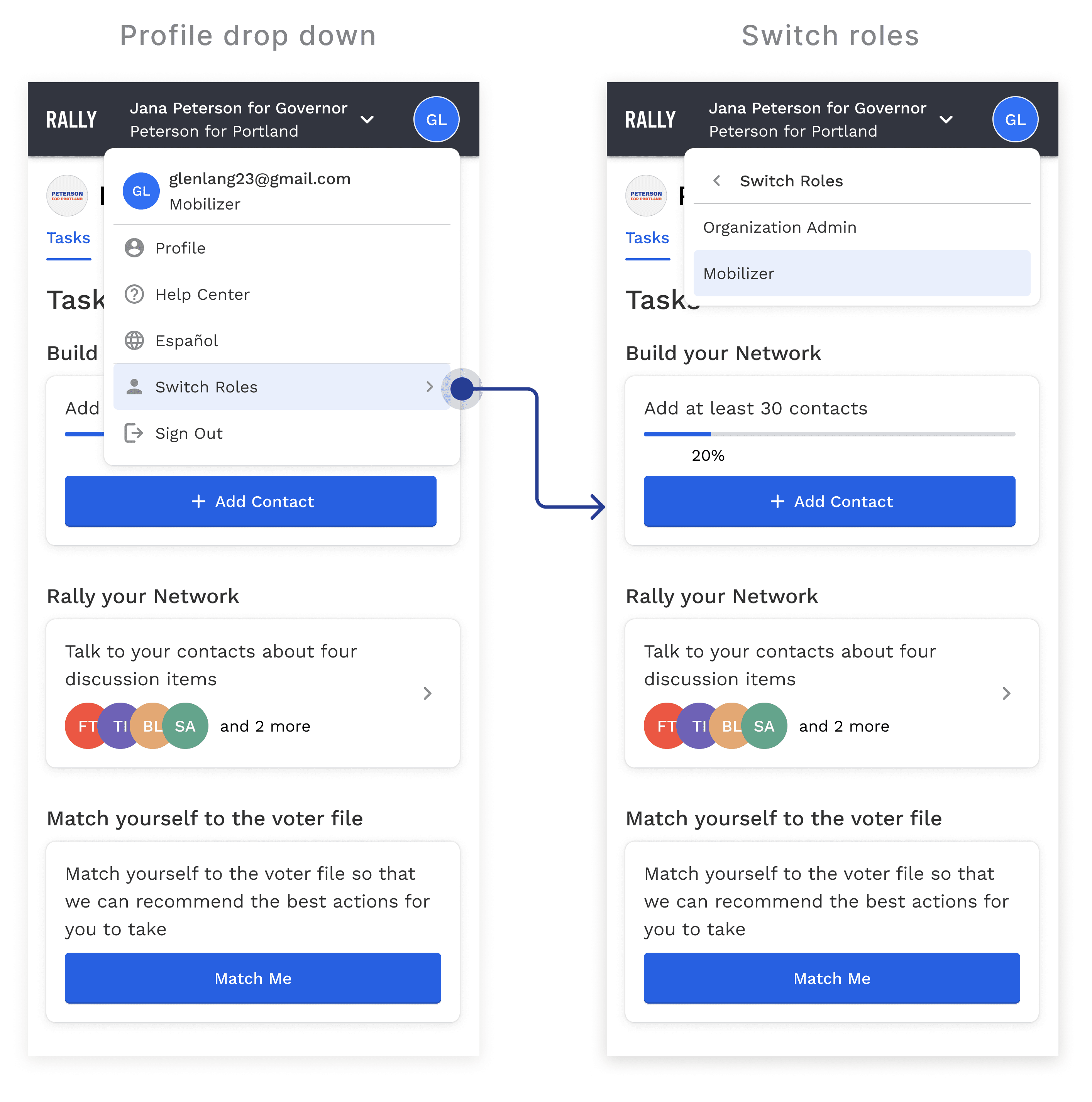
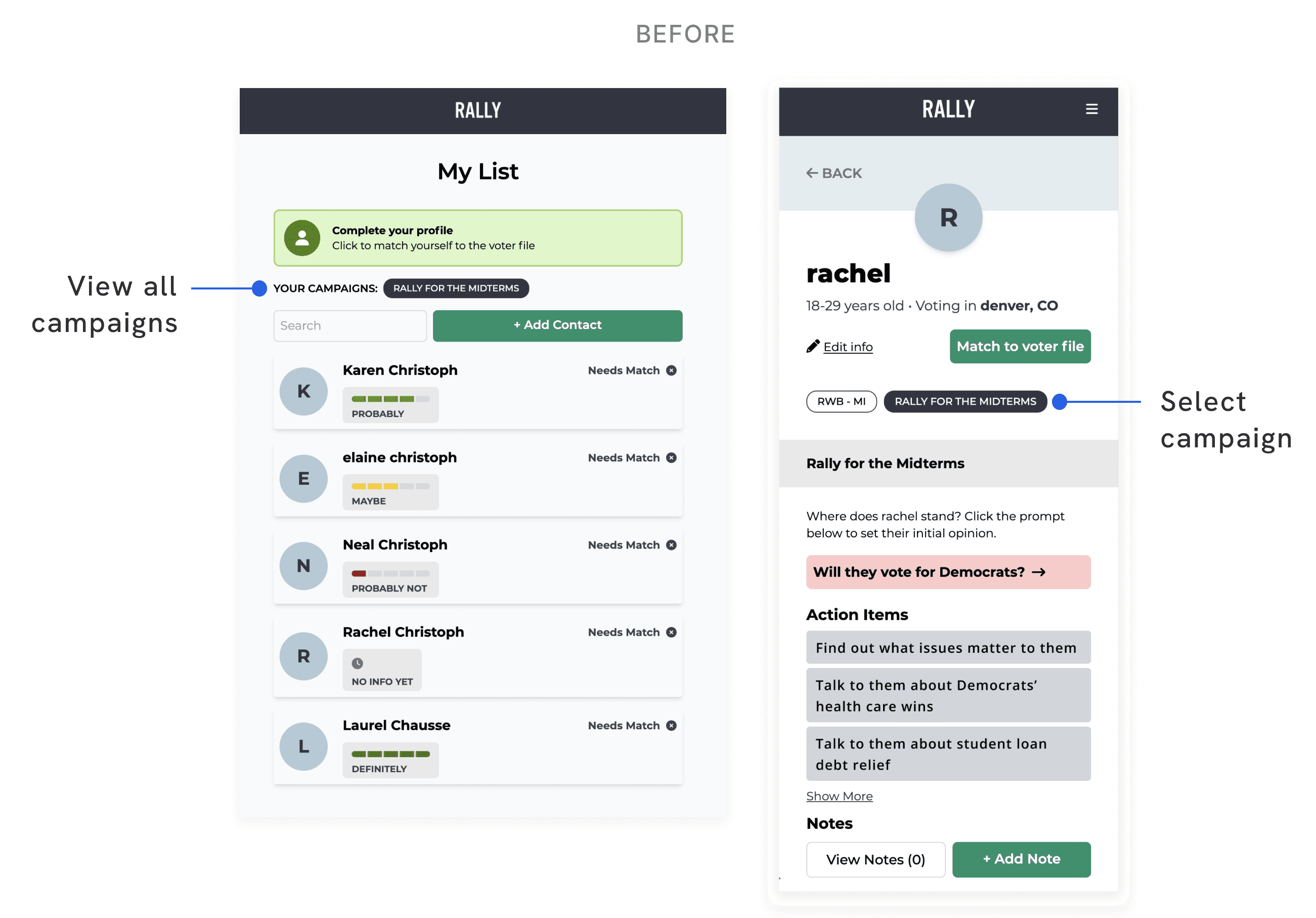
Switching & Adding Campaigns is Unintuitive
There was unclear information architecture for switching and adding campaigns
The placement of viewing which campaign one was in and switching between them was unintuitive
We analyzed the relational organizing competitor tools, along with their features and functionality. We talked with campaign staff and mobilizers about the pros and cons of working with these other tools.
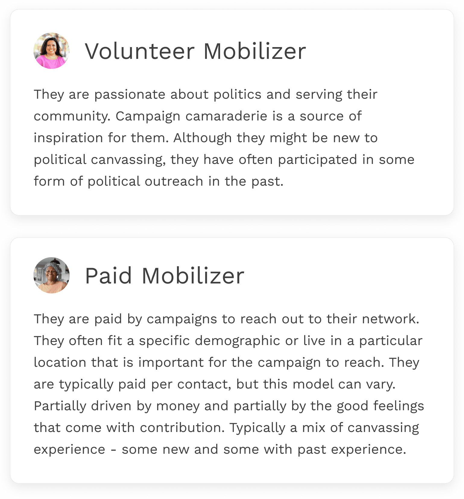
Mobilizers might be paid or volunteers depending on the campaign's budget and objectives. Age and technical ability of these users vary widely. Campaign admin analyze the mobilizer users in terms of their location, number of contacts added, number of interaction points with contacts, and their usage frequency of the app.
In user interviews, we discovered mobilizers were developing different strategies for outreach and their use of Rally’s tool. We documented these different use cases to reference during the design phase. User motivations tended to be intrinsic rewards for doing meaningful work or financial if they were paid mobilizers. Many also delighted in the solidarity of campaign work.
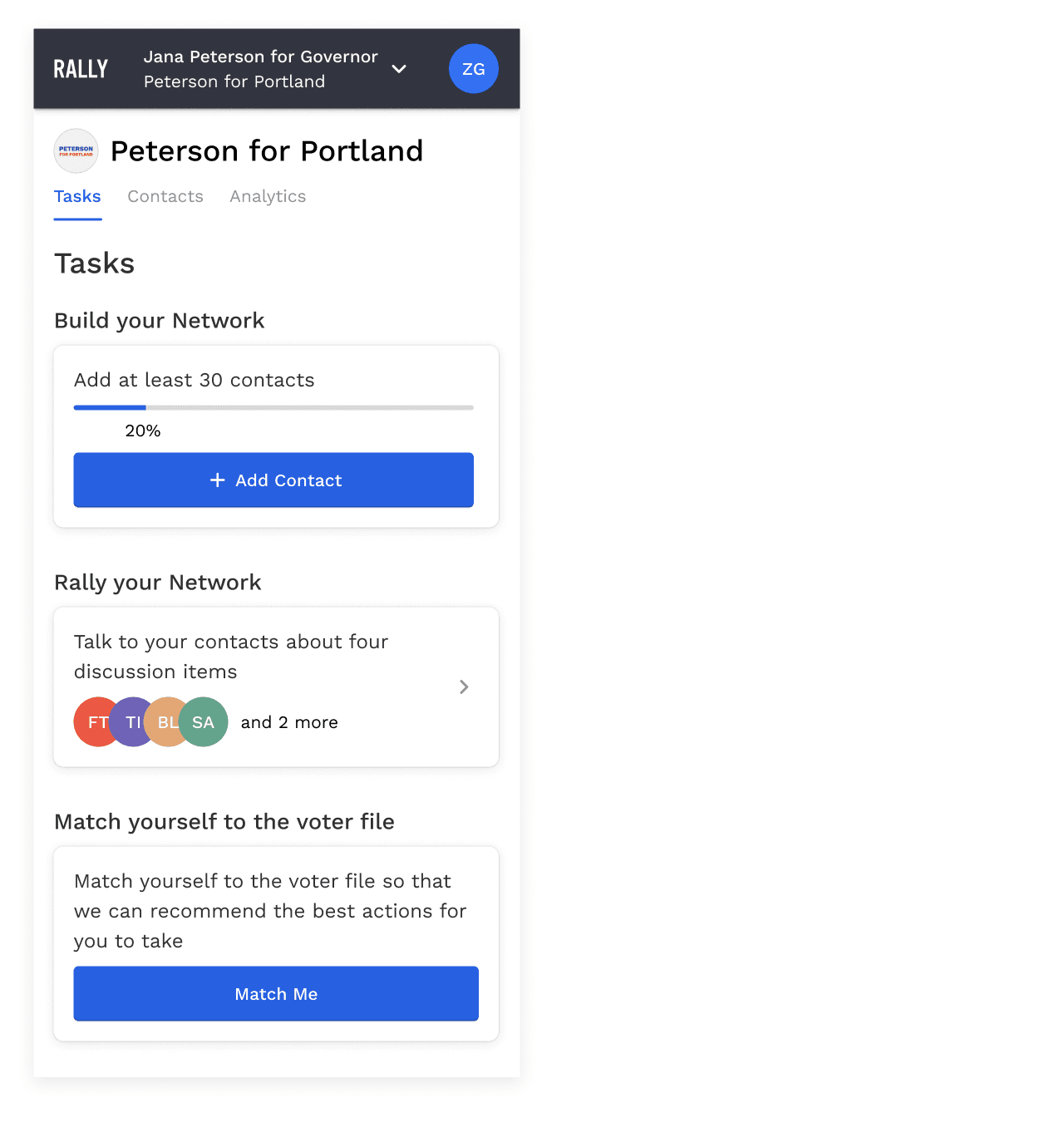
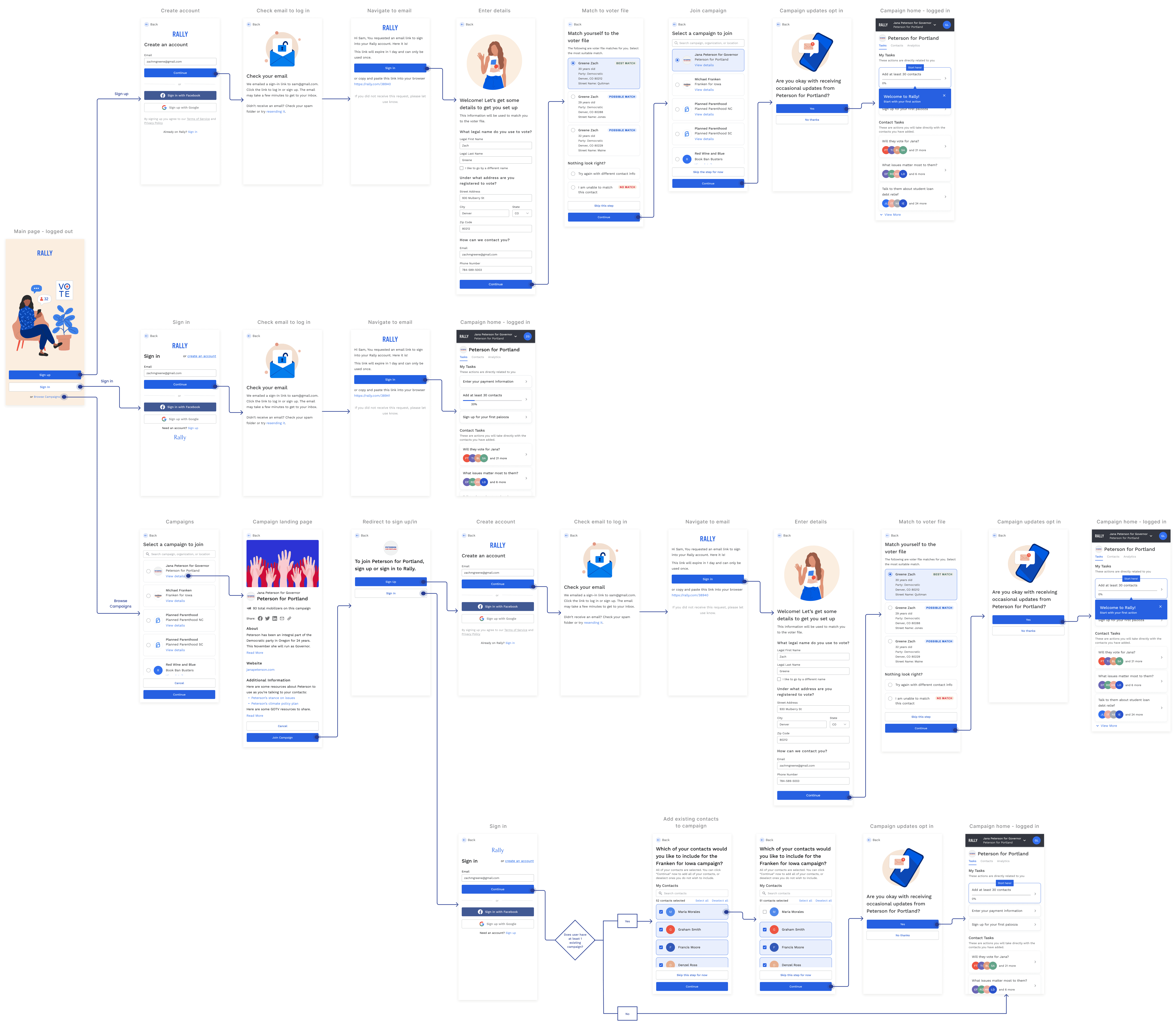
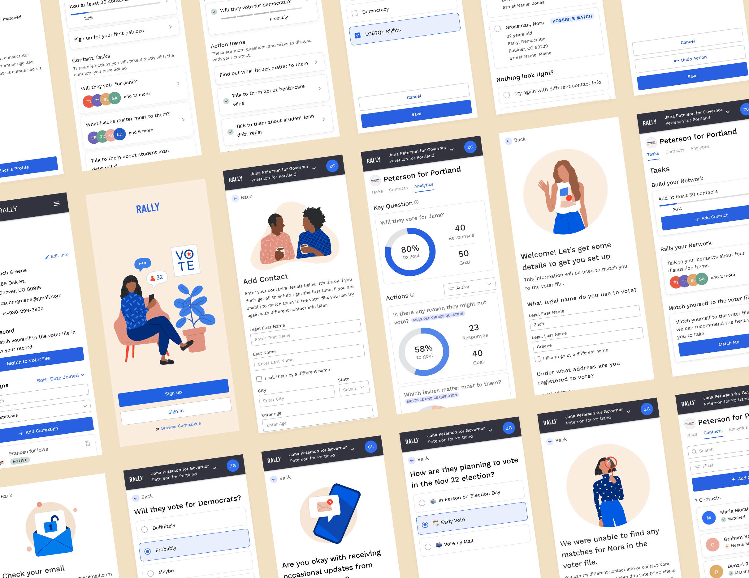
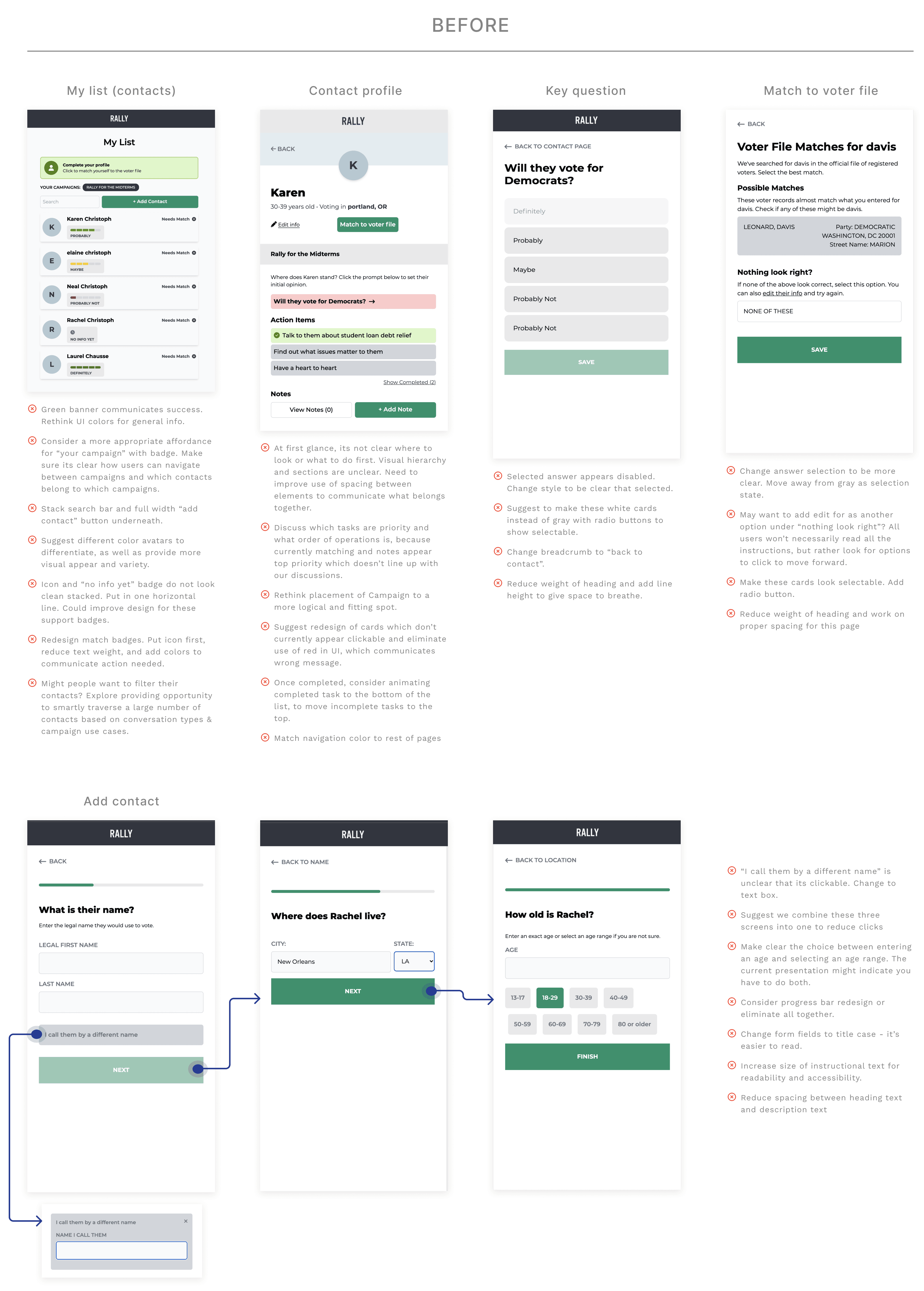
I started by redesigning the information architecture. On the primary navigation level, users were previously seeing just a list of all their contacts.

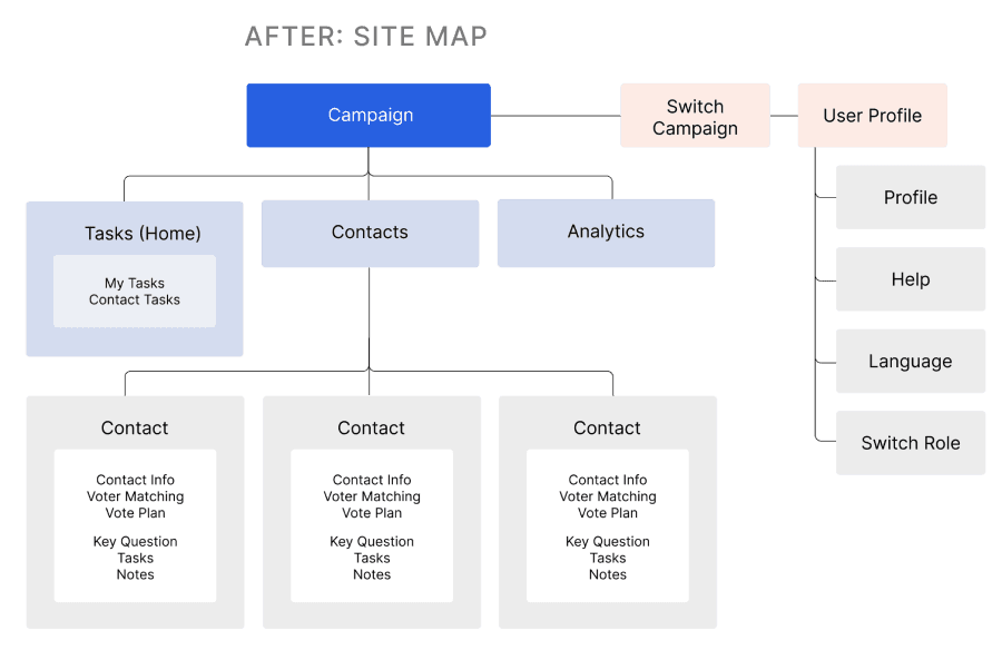
In the new site map, we added Tasks and Analytics tab, in addition to the existing Contacts tab.

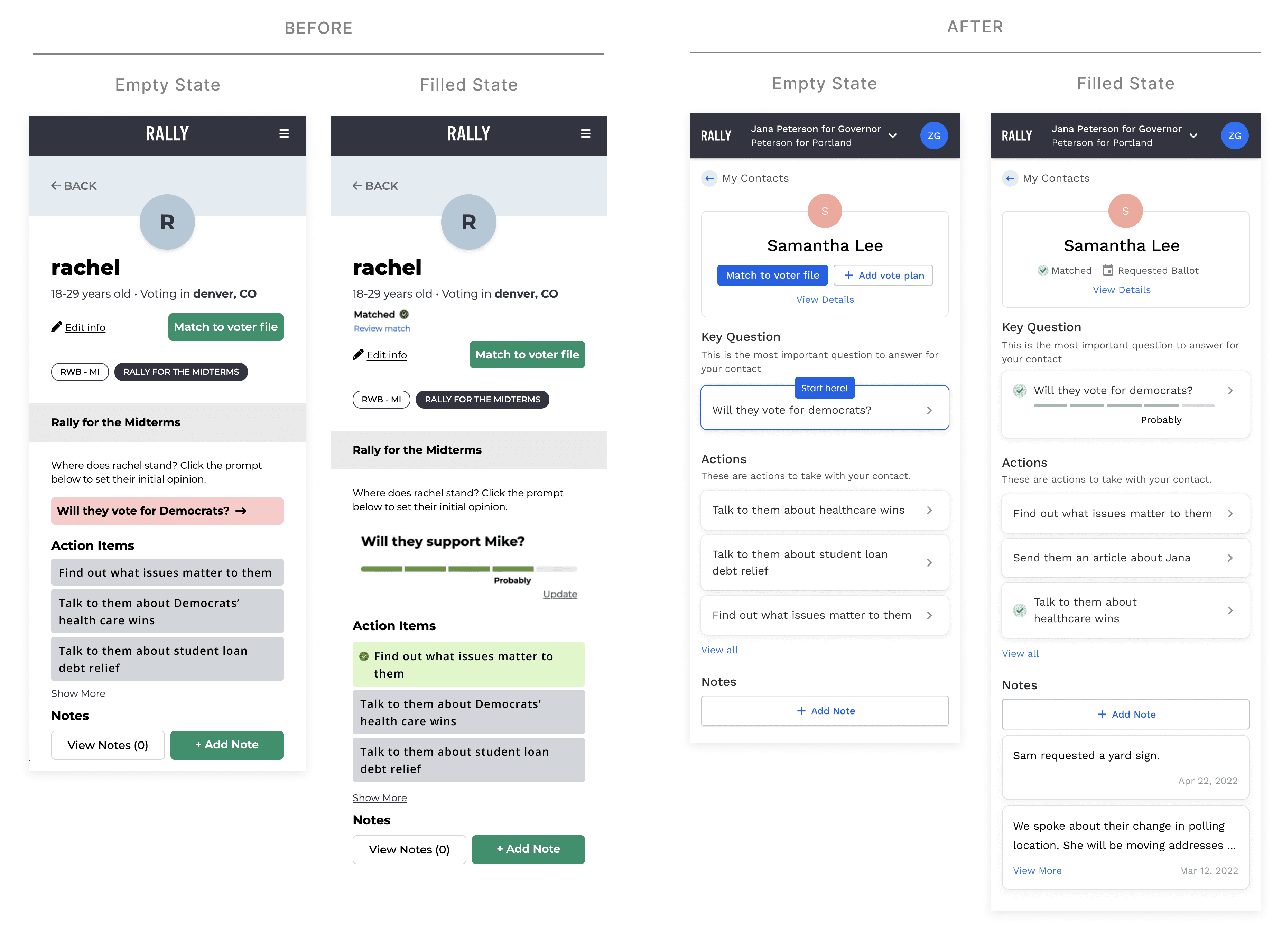
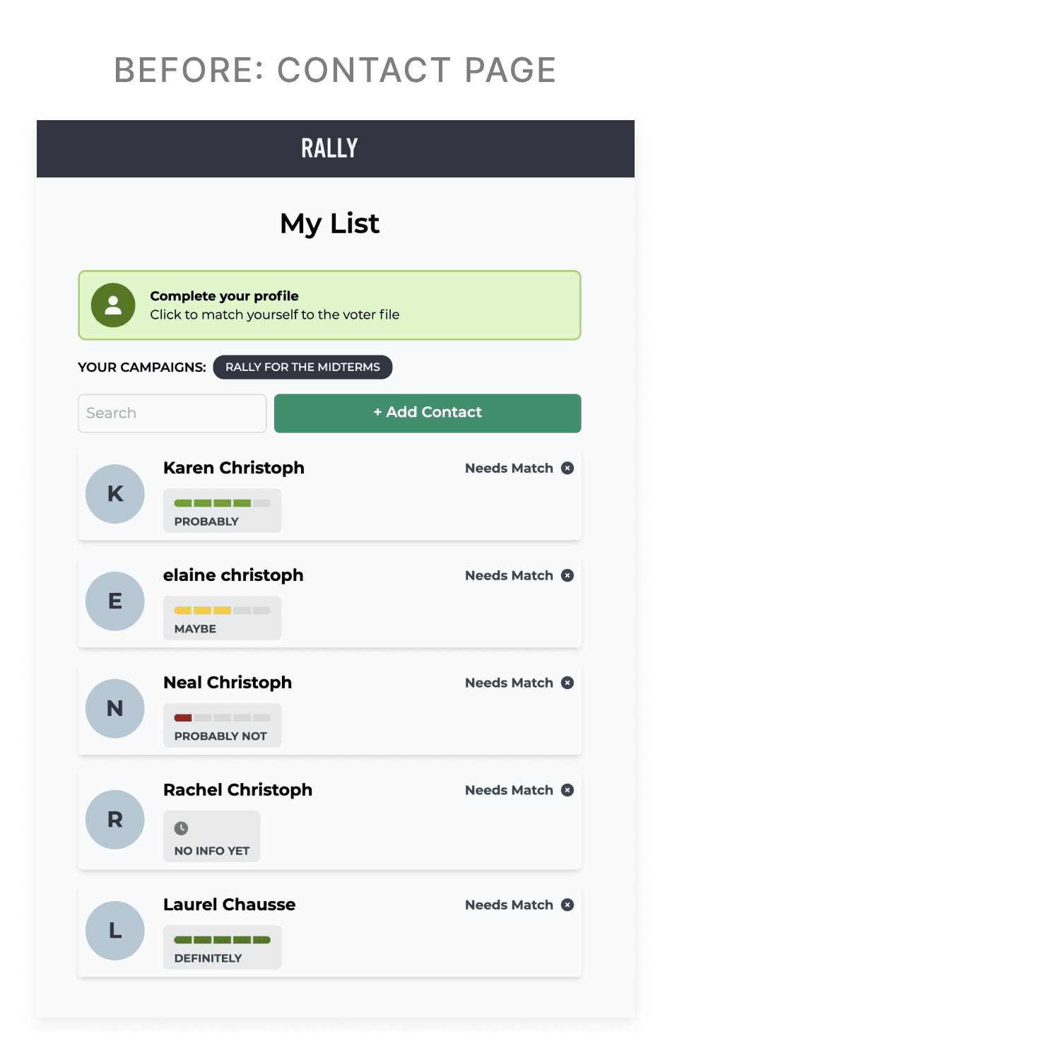
The pre-existing contact page lacked the ability to strategically drill down to contacts in a targeted manner. There was also unnecessary information crowding the contact cards and misleading iconography.
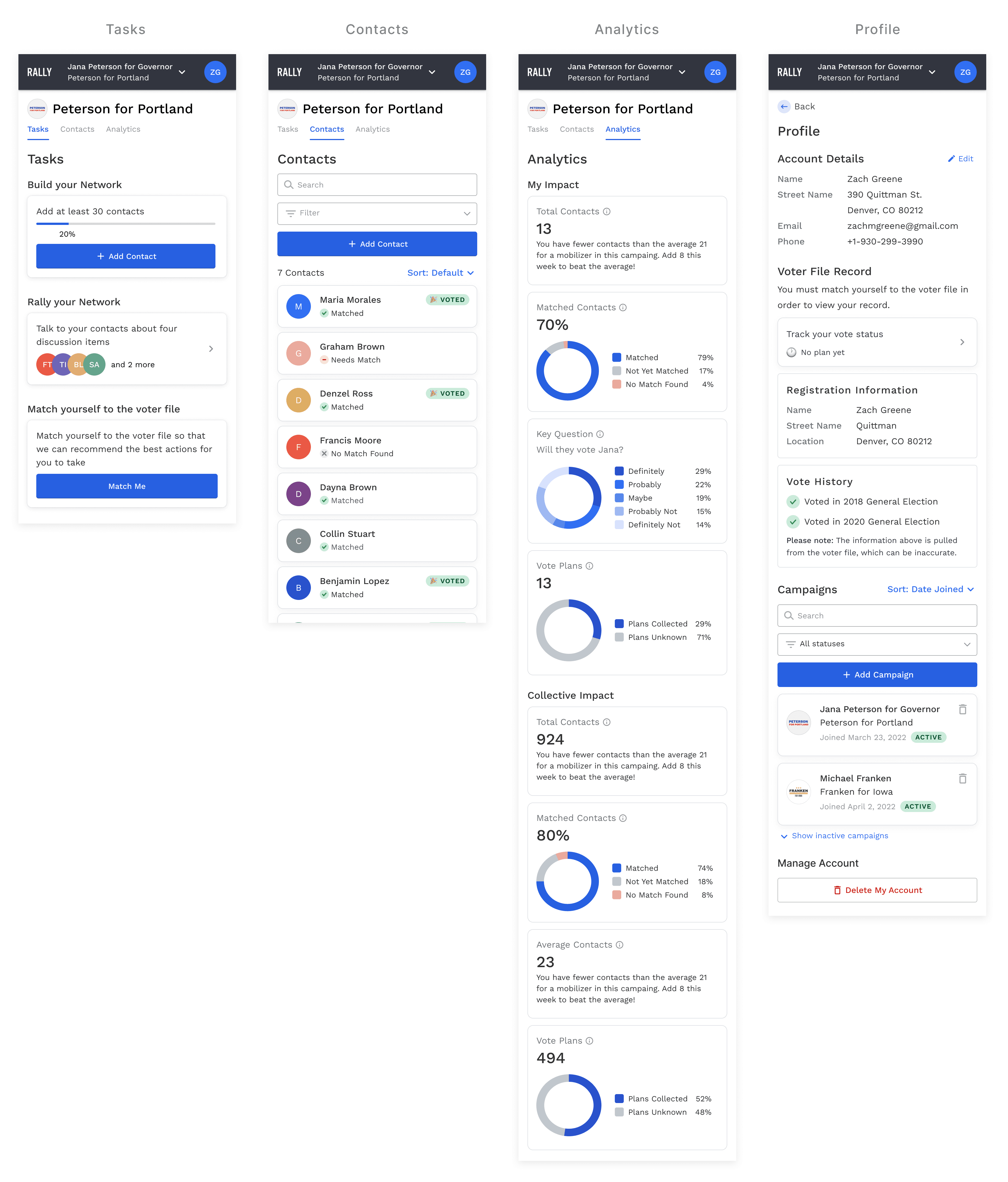
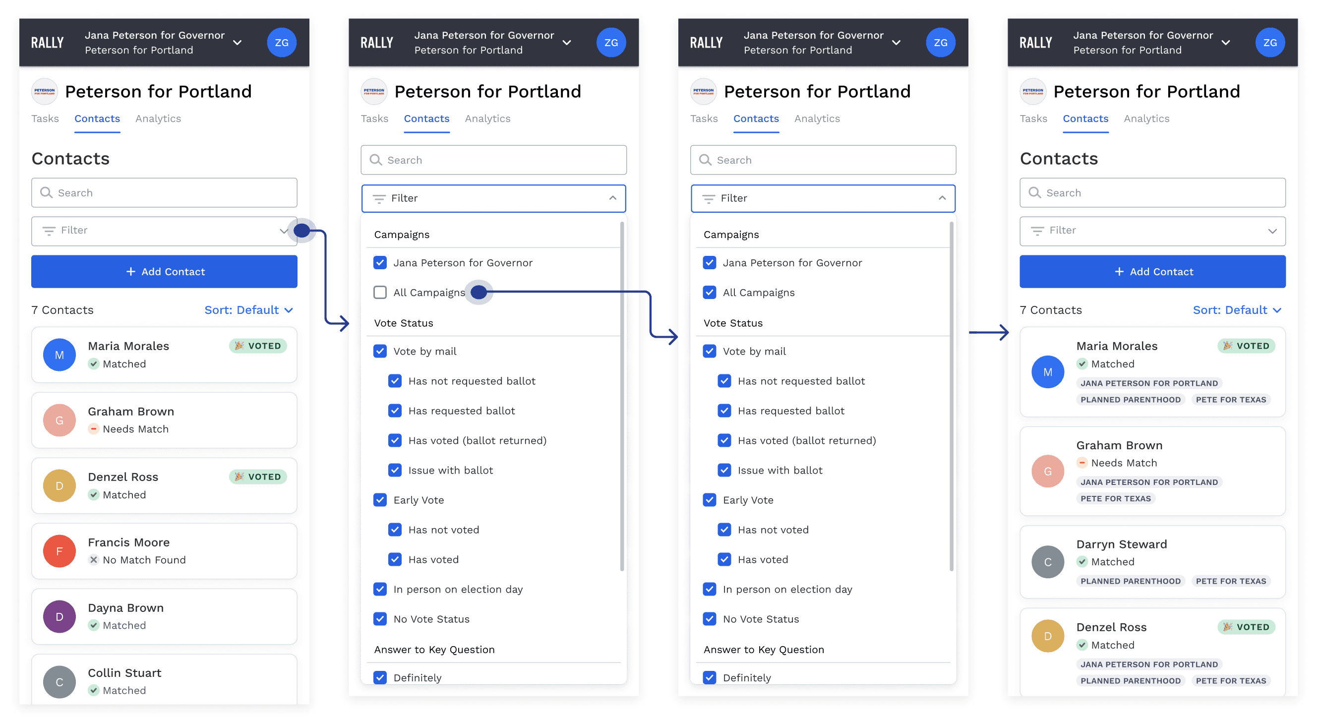
In the new designs, I minimized everything besides the important information on each contact card and updated the visual style and iconography. I added the ability to filter the contact list based on the campaign goals. For example, coaches can instruct their mobilizers to reach out to certain contacts based on specific criteria (i.e. the people who have not voted yet but strongly support your candidate).
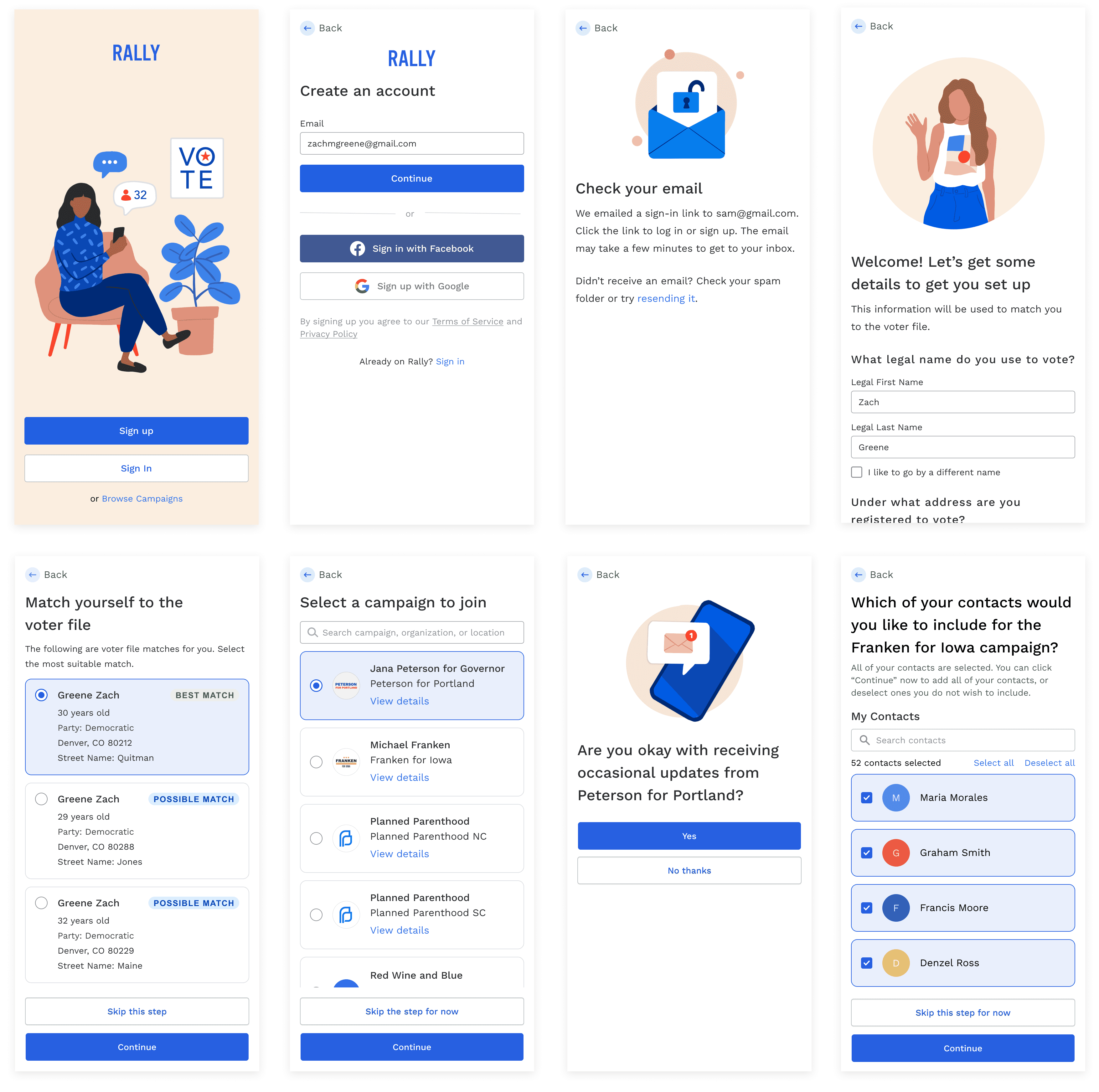
We wanted to allow users to view all of their contacts in one place, despite which campaign they selected in the upper navigation. If a user wants to view their contacts for all campaigns, they can filter to view all contacts, which populates campaign badges to differentiate which contacts belong to which campaigns (see image below).

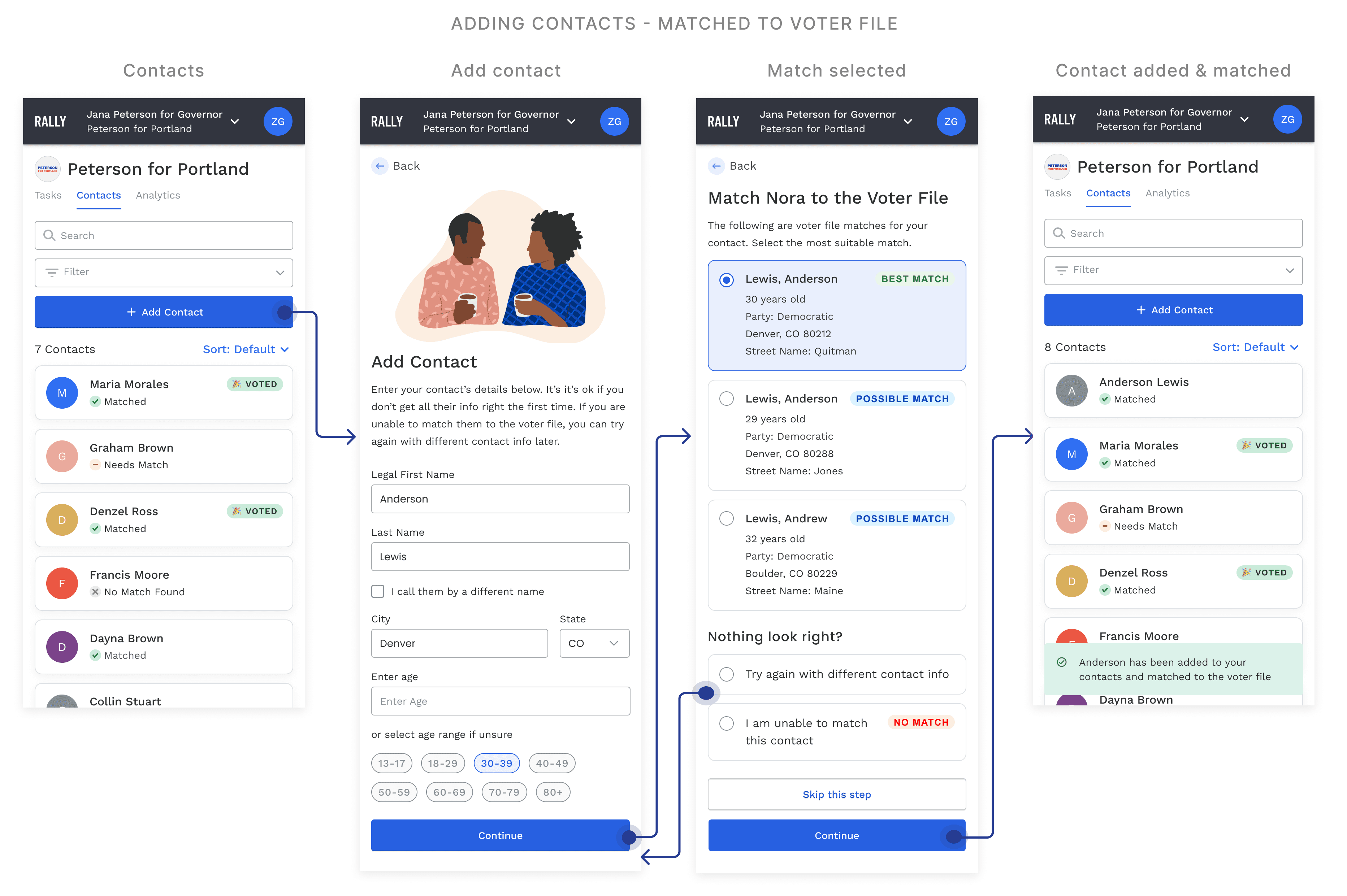

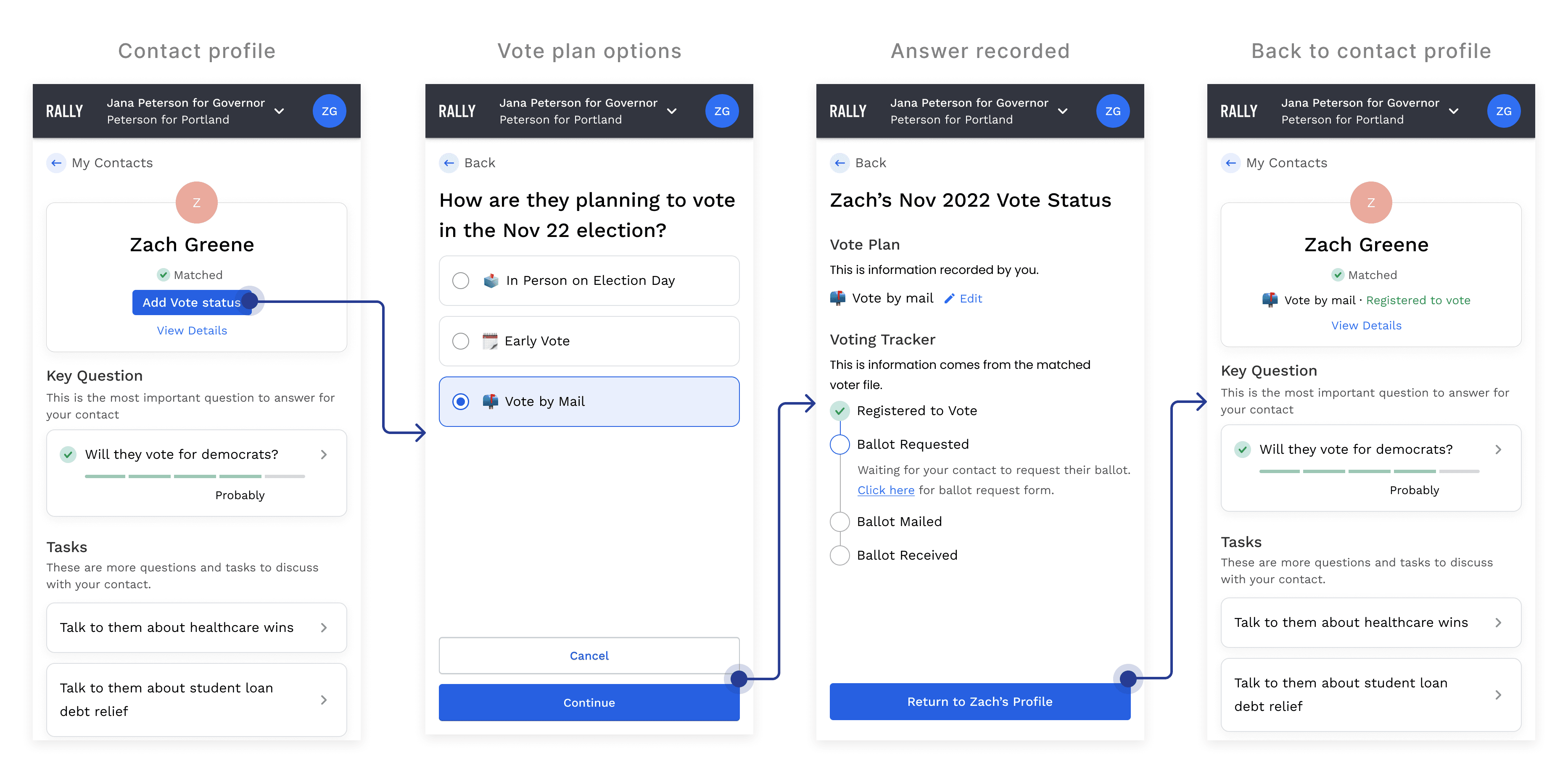
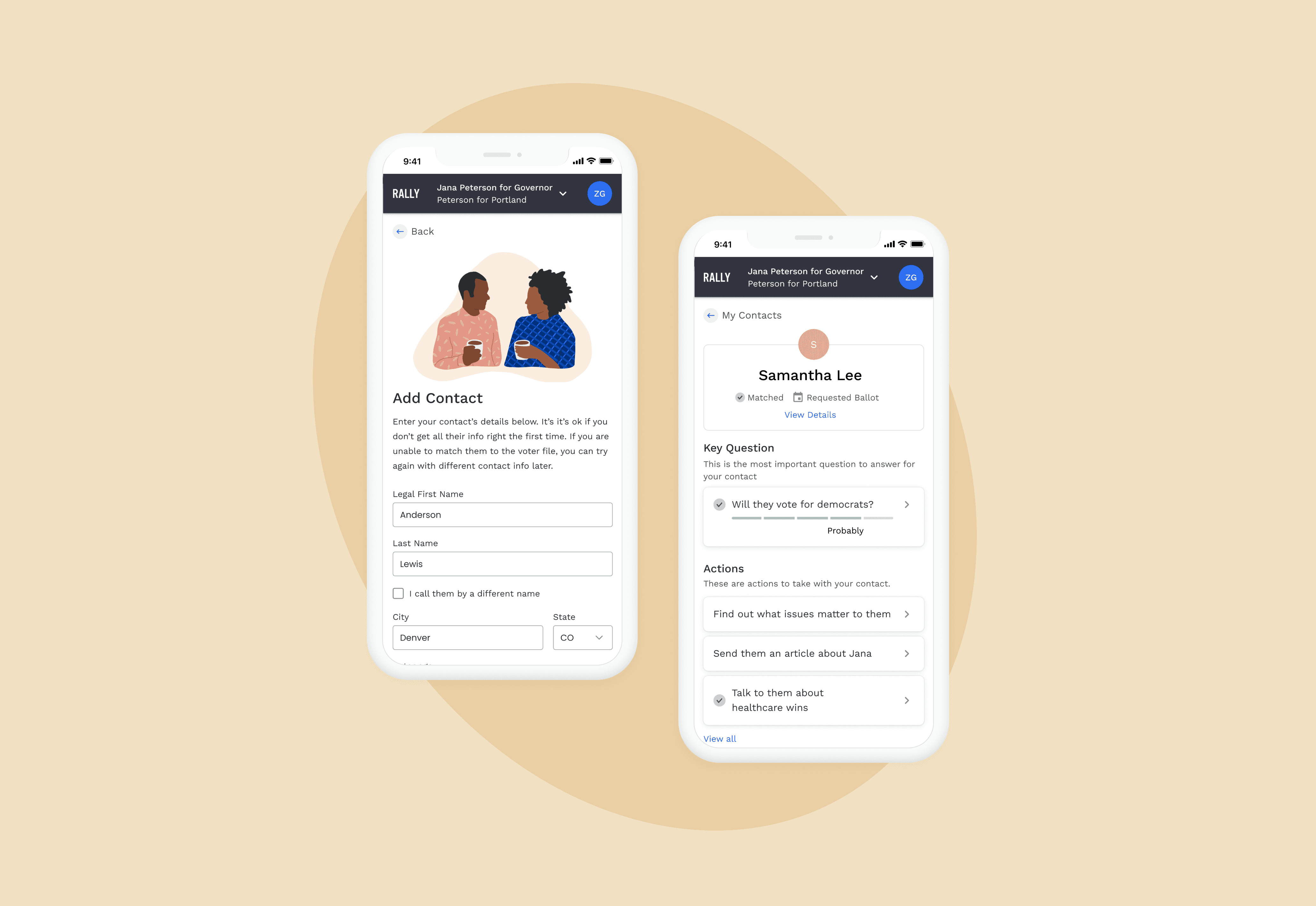
Each contact has a profile where users can view the contact's basic information, match them to the voter file if they haven't already, add their vote status, answer the campaign’s key question, address contact-related actions, and add notes about their conversations.
In the original contact page, there was misuse of UI colors with red and green. The visual hierarchy required too much thinking from the user.
In the new designs, I kept things simple with white cards, only using red and green colors when conveying meaning like success or error. Removing campaigns at this contact page level helped helped with clarity in visual hierarchy. To improve wayfinding, we guided the user to start with the key question. I added visual weight to the "Match to voter file" button since that was the single most important contact-related KPI.
In our analytics data, we noticed actions further down the list were sometimes getting missed and had less completion rates. Previously, action items remained in the same order on the list, even once they were completed. In the new designs, once an action was completed, that action card animated to the bottom of the stack, to prioritize newer ones up top.