Rally's Design System
Rally's Design System
Rally's Design System
product design
research
design audit
visual design
ui design
usability testing
Creating a design system to span Rally's SaaS products
Creating a design system to span Rally's SaaS products

About
About
About
Rally is a relational organizing tool for progressive political campaigns that mobilizes people based on their pre-existing contacts. One system is used by volunteer and paid participants to facilitate and manage conversations between them and their contacts. The other system is used by campaign admin to create and manage relational organizing campaigns and monitor the performance.

Overview
Overview
Overview
When I came onto this project, Rally’s product team had a fragmented visual language and no preexisting design library of reusable design components. This resulted in inconsistent styles and user experiences across their products. In order to scale the design and development of Rally, we needed to build a design system as a way to work faster, while ensuring consistent and unified UX.
When I came onto this project, Rally’s product team had a fragmented visual language and no preexisting design library of reusable design components. This resulted in inconsistent styles and user experiences across their products. In order to scale the design and development of Rally, we needed to build a design system as a way to work faster, while ensuring consistent and unified UX.
Team
Team
Team
I worked with a team of four developers and one product manger.
Nora Grossman (Product Manager), Nick DiRienzo (Head of Engineering), Peter Stein (Senior Software Engineer), Caesar Nuzzolo (Senior Software Engineer), Maureen Z. (Senior Software Engineer)
The Beginnings
The Beginnings
The Beginnings
Design Audit
Design Audit
Design Audit
I took inventory of Rally’s existing visual design elements and components. As I collected each piece of the existing UI, I organized them into their respective categories, documenting how and when they were used in the product.
This process helped me understand their visual qualities and variations of the current component inventory, which would help me make design decisions around styling and consistency moving forward.
Conversations with Stakeholders
Conversations with Stakeholders
Conversations with Stakeholders
I held conversations with product mangers and engineers about how to best design and and deliver the design system components based on technical and time restraints. With the assistance of engineering, I learned what design components already existed within the codebase. Learning how they were built helped inform how I might structure these components to create a simpler transition to a new system.
I held conversations with product mangers and engineers about how to best design and and deliver the design system components based on technical and time restraints. With the assistance of engineering, I learned what design components already existed within the codebase. Learning how they were built helped inform how I might structure these components to create a simpler transition to a new system.
Vision
Vision
Vision
I planned to use Figma to create an accessible design system and common visual language to unite the product. The design system would consist of rules, guidelines, and reusable components to span all existing and future designs for Rally. The system would be built in a way where it could be easily iterated upon and added to as needs changed. Any future changes to design system components would be automatically distributed to all existing designs within Figma and the product.
I planned to use Figma to create an accessible design system and common visual language to unite the product. The design system would consist of rules, guidelines, and reusable components to span all existing and future designs for Rally. The system would be built in a way where it could be easily iterated upon and added to as needs changed. Any future changes to design system components would be automatically distributed to all existing designs within Figma and the product.
Foundations
Foundations
Foundations
Guidelines & Design Standards
Guidelines & Design Standards
Guidelines & Design Standards
First, I established a common visual language that reflected Rally’s mission and brand personality. This language guided decisions for the foundational elements, such as color palettes, iconography, grids & spacing, and typography.
In the early stages, I standardized component naming conventions, accessibility requirements, and Figma file structure in order to ensure design and development could work within a consistent framework moving forward and to prevent confusion and errors.
Colors
Colors
Colors
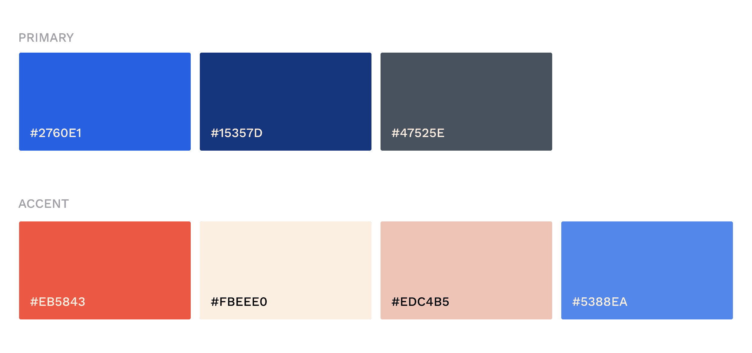
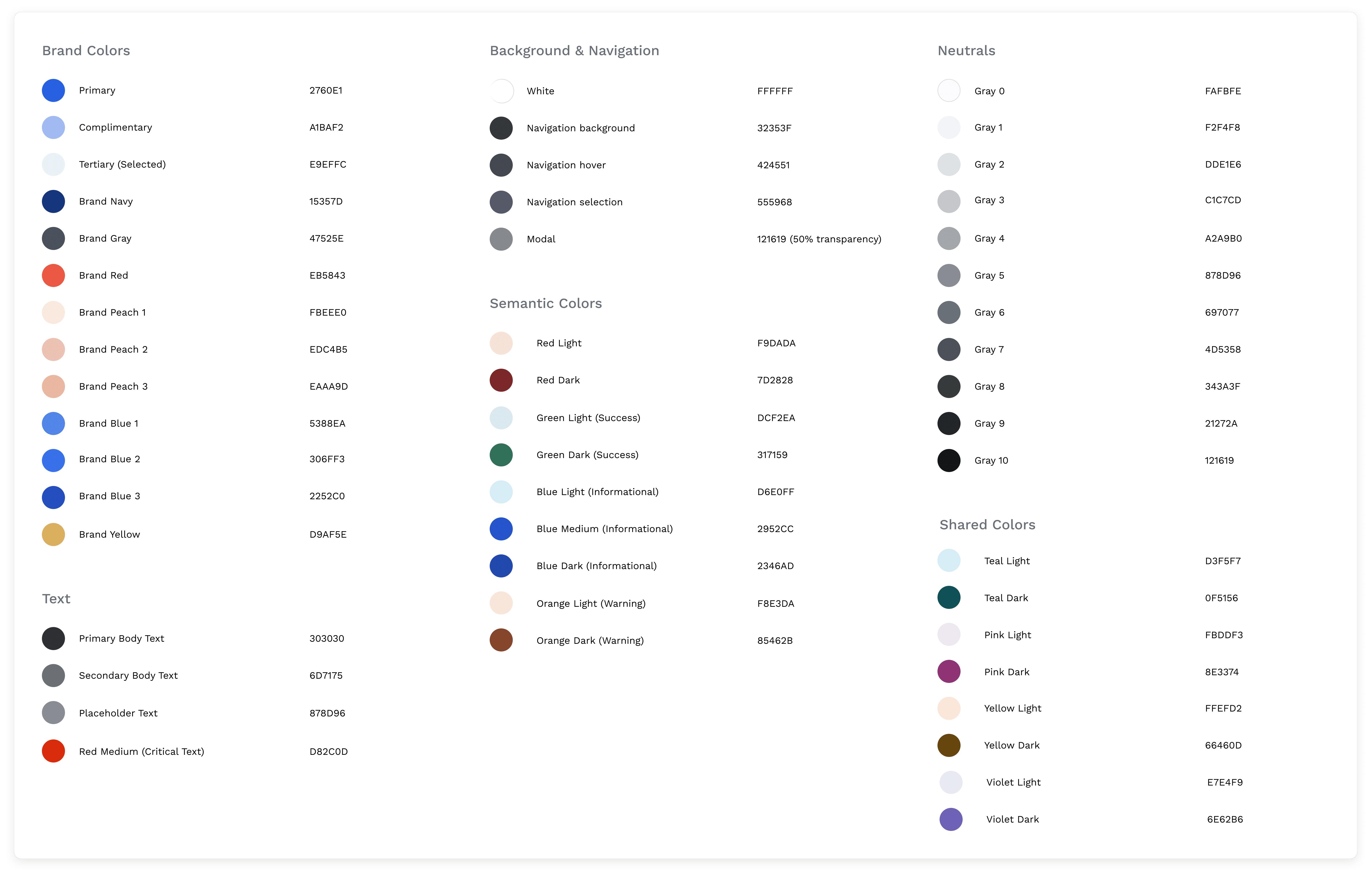
Brand colors had been previously established during Rally's marketing site design. Inspired by the brand palette, I selected neutral tones (a range of grays and blacks) with blue, cool tones to be used in text, icons, surfaces, and to indicate changed states.
I selected a range of semantic colors to communicate important information, feedback, status, and urgency. These are common color associations like red for errors and green for success.
Lastly, I chose a palette of shared colors to be used sparingly in components like avatars and badges. As I designed the UI, I ensured all common color pairings passed color contrast, accessibility requirements.
Typography
Typography
Typography
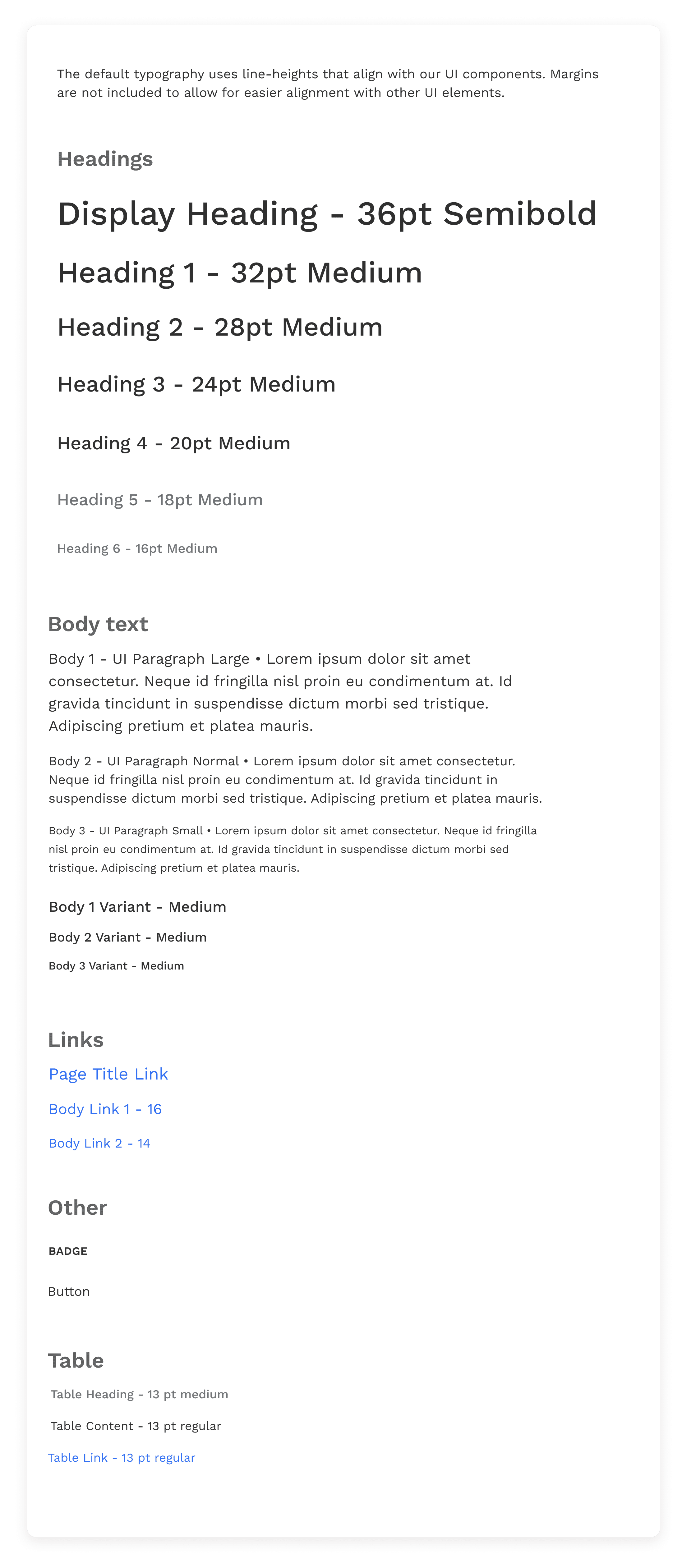
When I designed Rally's marketing site, I chose Forum as the heading typography and Work Sans for the body. In carrying these typefaces over to the product UI, the decorative nature of Forum wasn't working well in a more functional, tight-spaced SaaS environment, therefore I opted to only continue with Work Sans for the product design system. I created a set of type components for headings, body text, links, buttons, and data table text to be reused throughout all of Rally's products.
When I designed Rally's marketing site, I chose Forum as the heading typography and Work Sans for the body. In carrying these typefaces over to the product UI, the decorative nature of Forum wasn't working well in a more functional, tight-spaced SaaS environment, therefore I opted to only continue with Work Sans for the product design system. I created a set of type components for headings, body text, links, buttons, and data table text to be reused throughout all of Rally's products.
Iconography
Iconography
Iconography
I sourced icons from Material's icon library and created a style guide for creating custom icons.
I sourced icons from Material's icon library and created a style guide for creating custom icons.
Grids & Spacing
Grids & Spacing
Grids & Spacing
I used an 8 pixel grid system, where all spacing (margins, padding, etc) uses multiples of 8px, with the occasional 4px application.
I used an 8 pixel grid system, where all spacing (margins, padding, etc) uses multiples of 8px, with the occasional 4px application.

UI Components
UI Components
UI Components
Components
Components
Components
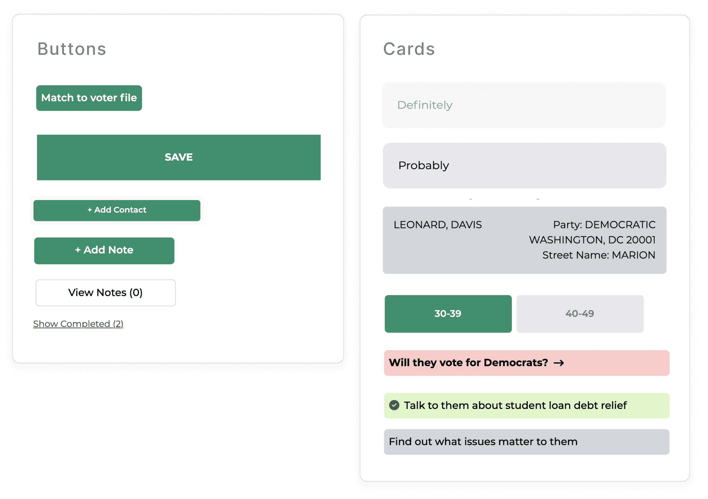
With the foundations in place, I created a system of design components.
With the foundations in place, I created a system of design components.


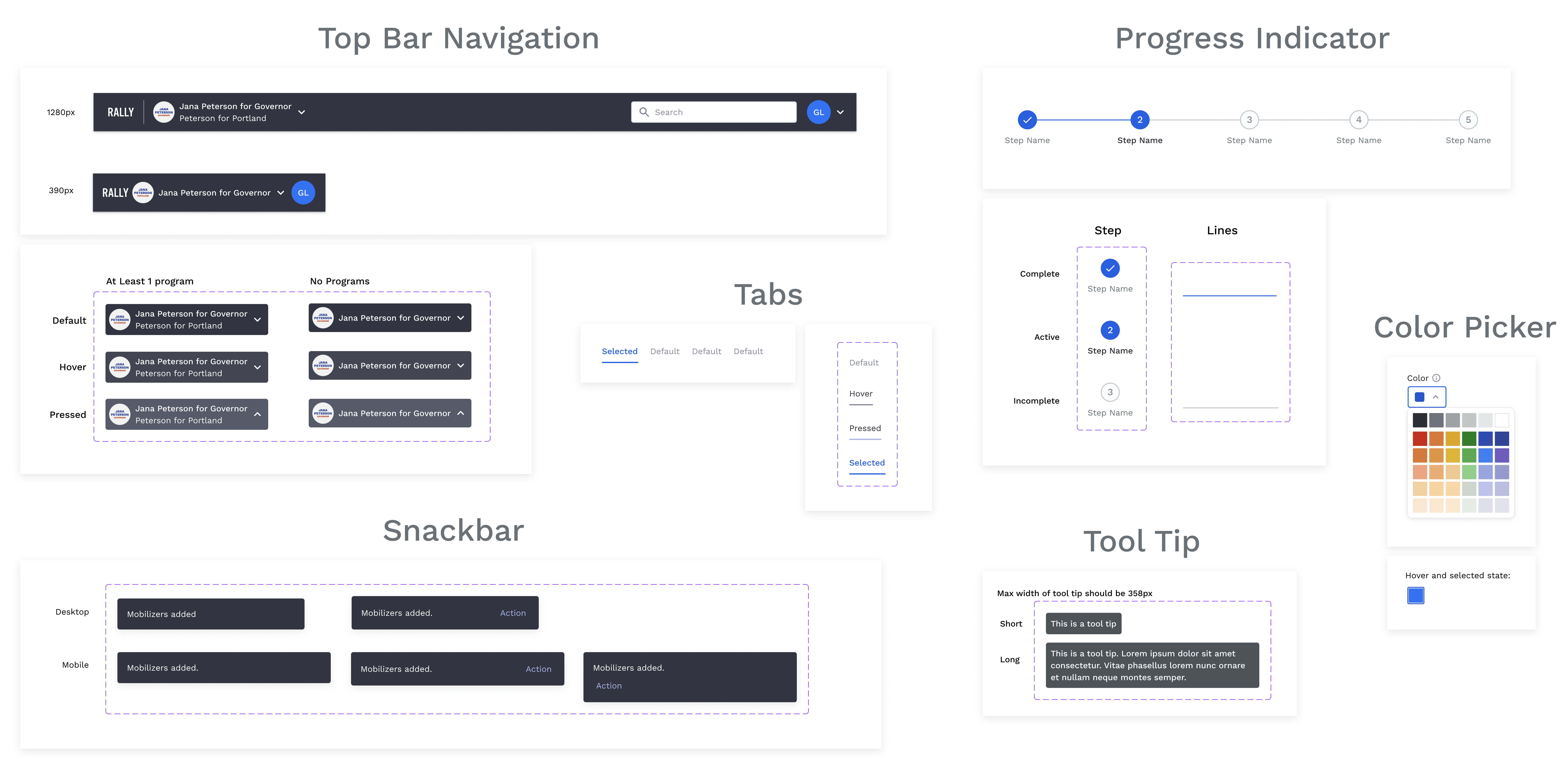
Variants
Variants
Variants
I created variants in Figma for most components, allowing designers to easily switch between variations of the same component. I developed structure, hierarchy, and naming conventions to be used across variants in order to create consistency for anyone utilizing the components.
I created variants in Figma for most components, allowing designers to easily switch between variations of the same component. I developed structure, hierarchy, and naming conventions to be used across variants in order to create consistency for anyone utilizing the components.

Responsive
Responsive
Responsive
I built the Figma design components to be responsive when resized across breakpoints and different design scenarios.
I built the Figma design components to be responsive when resized across breakpoints and different design scenarios.
Learnings
Learnings
Learnings
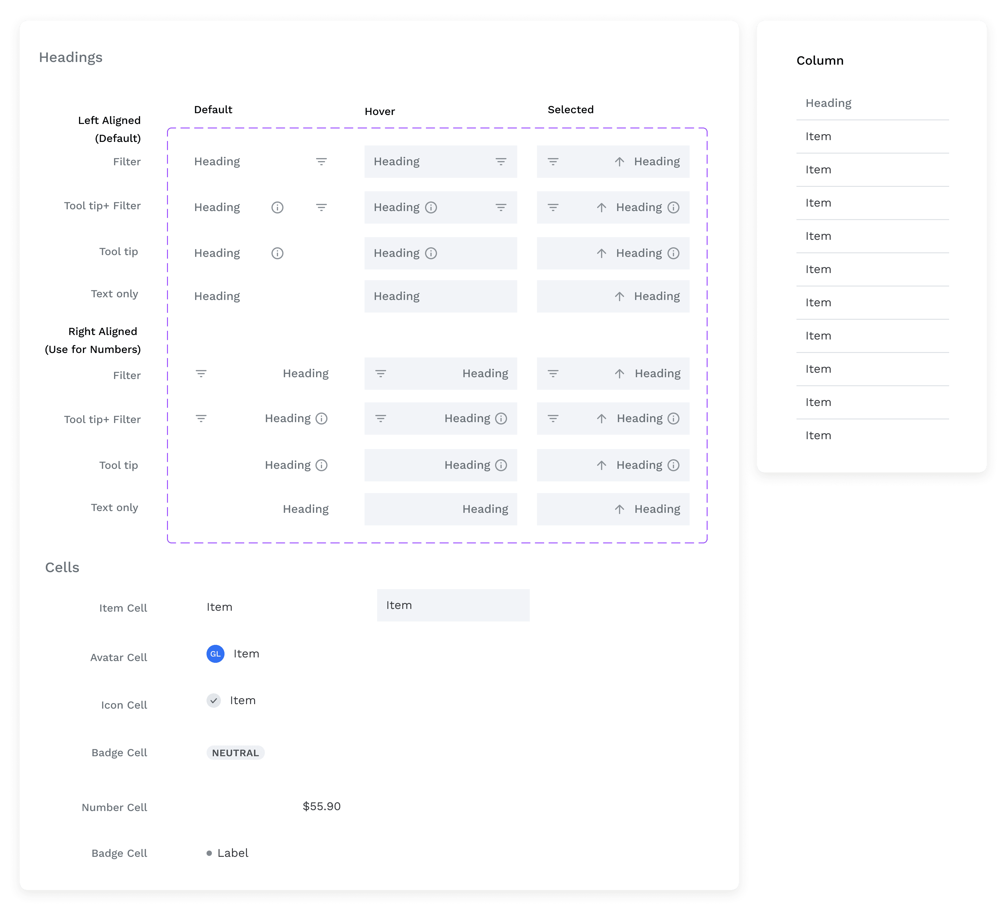
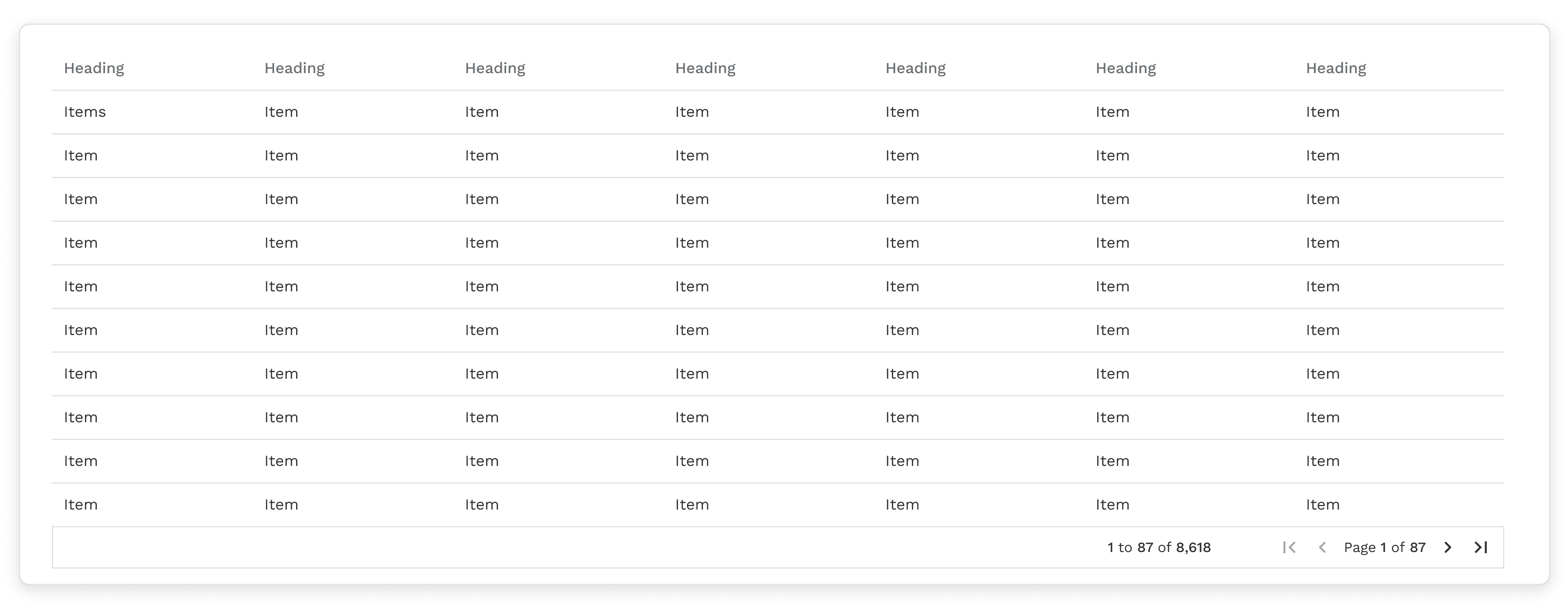
The Plight of Data Tables
The Plight of Data Tables
The Plight of Data Tables
It's proved challenging to create complex, responsive data tables in Figma with all the necessary variants that can be iterated upon without breaking what preceded it. Much was learned and I continue to aspire for the consummate data table.
It's proved challenging to create complex, responsive data tables in Figma with all the necessary variants that can be iterated upon without breaking what preceded it. Much was learned and I continue to aspire for the consummate data table.
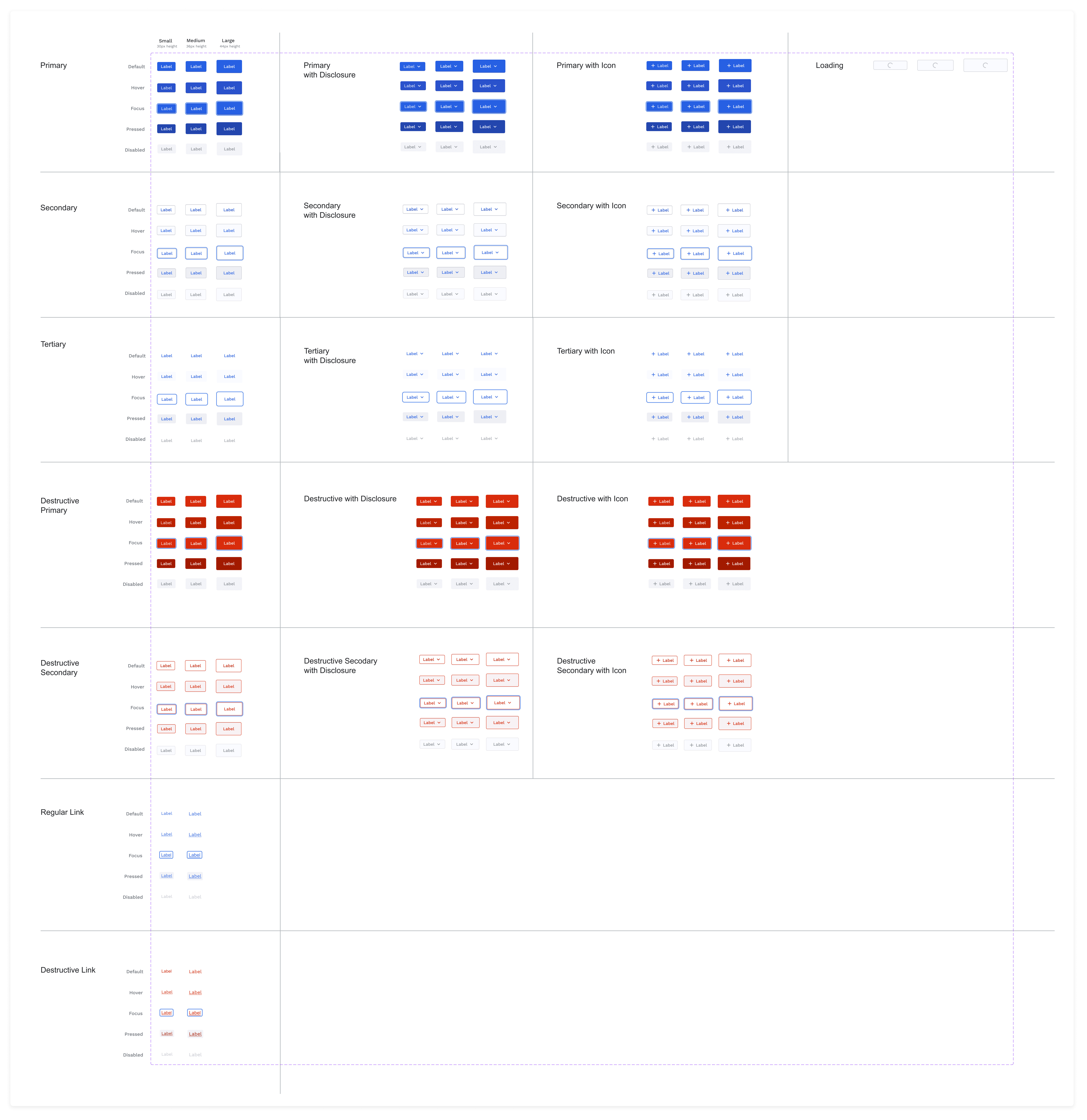
Did you know there could be 248 different variations for a button?
Did you know there could be 248 different variations for a button?
Did you know there could be 248 different variations for a button?
Neither did I.
Neither did I.
Outcome
Outcome
Outcome
The design system substantially reduced design and development timelines. Although difficult to measure with KPIs, we received positive feedback and the system streamlined all product UIs.
The design system substantially reduced design and development timelines. Although difficult to measure with KPIs, we received positive feedback and the system streamlined all product UIs.